Skip to content

Badge Designer

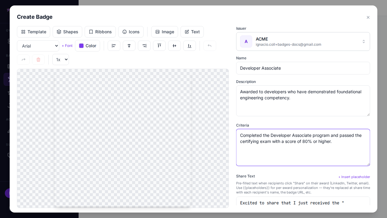
The Badge Designer is a visual canvas editor built into badges.ninja that lets you create professional badge images without any design tools.

Badge Designer — embedded in the Create Badge modal alongside the form sidebar

Overview

The designer opens when you click the image field while creating or editing a badge. It provides a canvas workspace where you can combine templates, text, and custom backgrounds to create your badge image.

Template picker with shape + color filters

Selecting a Template

The designer includes 80+ built-in templates organized along two dimensions so you can find one quickly:

  • 8 shapes — Circle, Rounded square, Hexagon, Shield, Octagon, Diamond, Banner, Seal
  • 8 color palettes — Gold, Silver, Bronze, Blue, Green, Crimson, Purple, Graphite

To pick one:

  1. Click Templates in the designer toolbar.
  2. Use the Shape and Color filters at the top of the picker to narrow the list. The counter on the right shows how many templates match (e.g. 8 / 84).
  3. Click a template to apply it to the canvas.

The generated templates are intentionally clean — pick a shape and palette, then add your own text, icons, and ribbons in the designer.

Template applied to the canvas

Adding Shapes, Ribbons & Icons

Shapes popover

Icons popover with color bar

Beyond templates, the designer ships with three additional asset libraries you can layer on top of any template:

  • Shapes — 80+ vector shapes (circles, shields, hexagons, stars, medals, seals, wreaths, banners, geometric forms) grouped into categories
  • Ribbons — 20 decorative ribbon overlays
  • Icons — 50 pictographic icons (atom, award, brain, briefcase, certificate, code, crown, diamond, diploma, graduation-cap, lightbulb, medal, rocket, shield-check, star, target, trophy, …)

Pick one from any popover and it's inserted onto the canvas at the current color. The Color bar inside each popover lets you re-color the asset before you insert it — useful when you want a different color than the toolbar default.

Uploading a Custom Background or Image

You can upload your own image to use as a background or as a layer on top:

  1. Click Upload in the designer toolbar.
  2. Select an image file from your computer (PNG or JPG recommended).
  3. The image is placed on the canvas as a selectable object — drag, scale, rotate, or send it behind other elements.

Uploading an image does not erase the template or any existing layers — it just stacks on top.

For full backgrounds, use a square image at least 600×600 pixels.

Adding Text

Text element added to the canvas

  1. Click the Text button in the toolbar.
  2. A new text element appears on the canvas.
  3. Click the text to select it, then type your content.
  4. Drag the text element to position it on the canvas.

You can add multiple text elements for different parts of your badge (title, recipient, date, etc.).

Changing Fonts

Text switched from Arial to Georgia — serif font applied to the selected text

The designer includes 11 fonts (Arial, Georgia, Times New Roman, Pacifico, Roboto, Open Sans, Montserrat, Lato, Raleway, Oswald, Playfair Display):

  1. Select a text element on the canvas.
  2. Click the Font dropdown in the toolbar.
  3. Choose from the available fonts.

The font preview shows how each option looks before you select it.

Changing Color

Color picker open; pick any hex — gold gives strong contrast on dark-blue templates

The toolbar Color picker controls two things at once:

  • Selected text — picks the fill color for any selected text element.
  • Default insert color — for shapes, ribbons, and icons inserted next, plus selected SVG objects (re-colors strokes and fills in place).

Pick a color from the palette or enter a hex code. Inside each shape/ribbon/icon popover there's also a smaller Color bar for one-off color choices that don't change the toolbar default.

Aligning Elements

Text centered horizontally and vertically via the toolbar alignment buttons

The 6-button alignment row works on the selected object(s) relative to the canvas:

ButtonAction
Align leftPin to canvas left edge
Center horizontallyCenter on the canvas X axis
Align rightPin to canvas right edge
Align topPin to canvas top edge
Center verticallyCenter on the canvas Y axis
Align bottomPin to canvas bottom edge

When you drag an element near the canvas center, dashed purple snap guides appear and the object snaps into perfect alignment.

Multi-select & Layering

  • Hold Shift and click to select multiple objects, or drag a selection box across the canvas.
  • Use Send to back / Bring to front to control z-order.
  • Press Delete or click the toolbar Delete button to remove the selection.
  • Undo / Redo (or Ctrl+Z / Ctrl+Shift+Z) walk through the last 20 changes.

Deleting Elements

  1. Select the element you want to remove (or shift-click for several).
  2. Click the Delete button in the toolbar, or press the Delete key.

Tips for Good Badge Design

  • Keep it simple — use clear text and avoid clutter. The badge will often be displayed at small sizes.
  • Use high contrast — make sure text is readable against the background.
  • Include the badge name — recipients and viewers should understand the credential at a glance.
  • Square format — badges display best as square images.
  • Brand consistency — use your organization colors and fonts across all badges.
  • Test at small sizes — preview your badge at 100x100 pixels to ensure readability.

Saving the Badge Image

Final composed badge

When you are satisfied with your design, click Done or Save in the designer. The image is captured from the canvas and attached to your badge. It will be uploaded to IPFS when you create or save the badge.

badges.ninja Documentation